
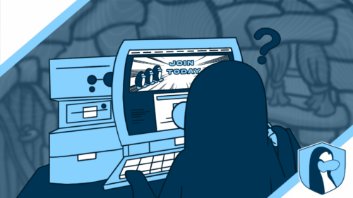
Having a clean and appealing army website is vital for success. Today, we are going to examine and explore how much the army websites have changed and evolved over the years.
Designed by Cassie
Websites have been an essential part of Club Penguin armies since the start. They are useful for various things, such as recruiting new members, posting guides, and promoting the army. Websites have evolved over the years, becoming more modern and smooth. In this post, we are going to examine different websites of various armies.
army of club penguin
The first website we will be examining is the Army of Club Penguin. On the website of May 2020, we can see 7 categories and a large button saying “CLICK HERE TO JOIN”. The biggest differences are the layout, the join button, and the style. In the old website, the categories were under the graphic. Now they are at the very top of the page, and we can also see that the ACP website has shifted from having numerous graphics to focusing more on events and trophies. The join button has also changed. The join button used to be extremely large, now it’s smaller and text instead of a graphic.
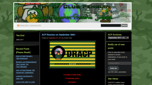
ACP’s website in 2017
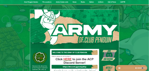
Screenshot of the newest version of the ACP website
templars of club penguin
The second website we are gonna examine today is the Templars of Club Penguin. The old website was very simple, with few graphics. We can see a player card for the uniform and the army’s name and logo. There was no background and only 5 categories. The biggest changes are the banner, the layout, and the background. As we can see now, significant changes have been made to the new version of the website, including an updated banner, layout, new categories, and background. Also, a big join button is now there instead of the text.
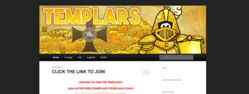
TCP’s website in March 2020
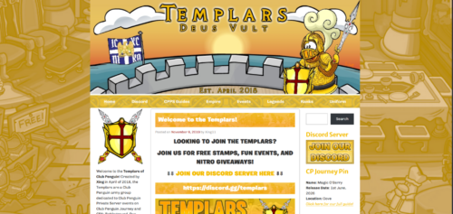
Current version of the TCP website
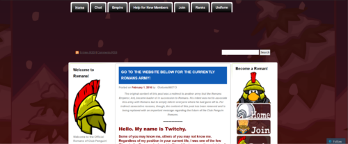
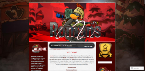
ROMANS of Club Penguin
On the old Romans of Club Penguin website, we can see 7 categories at the top, along with a search bar. The website does not have a banner. The biggest differences are the banner, graphics, and join button. We can see that in the new website, there isn’t a join button, but there is a banner and a higher-quality background.
Romans website during March 2016
Romans current website
DORITOS OF CLUB PENGUIN
The last website we are going to examine is the Doritos of Club Penguin. In the old Doritos website, we can see that there are no categories and join button. In the current website, there are 8 categories on top and a join button. The banner now looks like the town with a sunset instead of a mountain. Instead of the welcome banner, there is the Doritos logo.
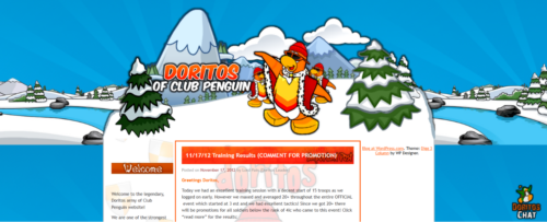
The Doritos website in November 2012
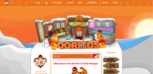
The Doritos current website
Websites have evolved over the years and seem to be becoming better and better. What do you think? Do you think websites will evolve any further or stay the same?
klombe
Reporter in Training
More Information

italian club penguin player who eats pizza all day