
The Nachos were one of the first superpowers of the Club Penguin army community. Come with me now on a journey of the Nacho Army’s vexillological evolution, and expect something vaguely entertaining from one of CPA’s first hotspots. Let us explore the Nacho Flag!
Designed by Dino
Flags and Army Identity
Flags are an essential part of geopolitics. Especially in terms of national identity, they play a crucial role. In this case, it would be more appropriate to refer to it as the identity of an army. Nevertheless, flags can be a strong symbol indicating the connection of an individual to the greater group. This being part of something is essential for an army’s unity and performance. Hence, flags have great potential in shaping the identity of an army, particularly in establishing a sense of pride. But also for the formation of hate against the foe, they can be effective.
Most of the time, flags are overlooked as just a small part that makes up the army as a whole. Usually disregarded, they are likely the first thing individuals will associate with and note about a particular army. Members of an army have often been confronted by various means of symbolism used in such a context. They have likely felt the impact symbols can have in a community, even for a community as small and niche as a Club Penguin army.
The First flag (2010)
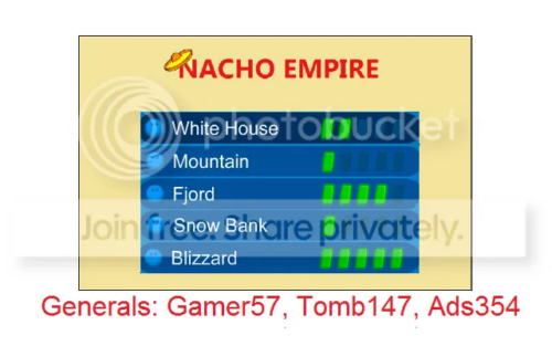
The first Nacho flag, featuring a lot of textual information
The first flag wasn’t really a flag. Designed early in the army’s history, the Nachos never really made a strong case for using a flag until later. As a result, coverage on the year this flag even entered use is disputed, with my sources (the Nachos’ website) pointing to 2010, due to 2 out of the 3 leaders joining the army’s ranks that year. While not adopted to the same standard as its younger counterparts, it is still sanctioned as an official flag of the Nacho Army. We can, however, assume Gamer57, Tomb147, and Ads354 were behind the creation of the flag, as this flag was commented as made by its leaders.
It has a white background with the generals (leaders of the army) of the flag’s time written in red, while a beige square is placed inside the flag. It includes a list of all the servers the Nachos owned and the name “Nacho Empire”. The text wears a sombrero, Nacho’s head item, while the watermark I study as an error caused by the Nachonnians transporting pictures of their old website into their latest website (and seemingly only one still running).
Well, there was an attempt. I can’t really say I like the design at all. Not only did it get dated due to its information, but it’s also dated for its poor look. There’s very bare symbolism to speak about outside of the sombrero. Here’s to actual flags later on.
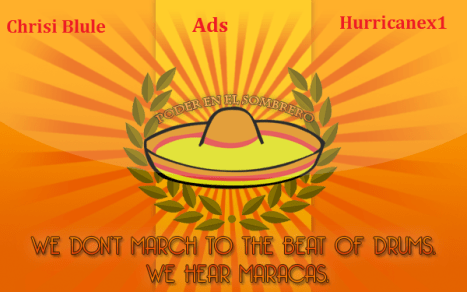
The second flag (2010-2015)
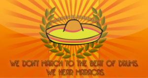
The second Nacho flag, with a more flag-like appearance; the flag’s bottom motto reads: “We don’t march to the beats of drums. We hear maracas.”
After a flag contest, the next five years would be marked by variants of this Nachos‘ flag. I say variants because it would be tradition to write the names of the leaders on the flag, similar to the first flag; we’ll get to see some examples later. While I come empty-handed in my search of who made the flag, the flag manages to forge strong connections with the army, especially compared to its older sibling.
This flag features an orange tricolor mixed with 40 rays radiating from the center, as well as a 3D shadow effect. All of these are colored a relatively similar orange, while at the center is where we see the most diversity. The center includes a charge of a sombrero with branches, likely olive, with a motto on top reading “Poder en el sombrero” (Spanish for “Power in the sombrero”). A second motto is written below the de facto coat of arms, “We don’t march to the beat of drums. We hear marracas.” It became one of the Nacho Army’s most iconic mottos, becoming a well-known quote in the army community.
A much-needed update to the previous flag, as this one can mark a proper identity. The use of Spanish on the motto and sombrero marks a closer identity to the “Nachos” aesthetic; meanwhile, the background really looks of its time with its shadows. This flag could probably be remastered into a real beauty with enough care. I’m not a big of a fan of placing orange text on orange, though. Kind of hard to read it.
Variants of the Second Flag (2010–2015)
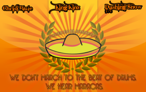
A variant of the second Nachos flag
Another variant of the second Nacho flag
These are the examples I was talking about. The only primary difference is the fact they include the names of the leaders as of the time of the flag. Funny enough, these flags are of a higher quality, so you can actually see some of the finer details.
The third flag (2015)
A variant of the second Nacho flag
A secondary flag contest would be held, but its submissions were closed off to only two options. The loser of which would be pushed as the Battle Flag, and the winner as the Homeland flag. Both submissions were presented by Fluffy9404, an HCOM member of the Nacho Army. Soon, it would be Option 2, the one you’re seeing above, as the winner, by an undisclosed amount of votes. The flag finally went into effect on March 1, 2015.
It’s very similar to the previous flag, as it literally cuts off the center of the flag from the rest of it, keeping only the charge and its motto, “Poder en el sombrero.” The details behind the sombrero remain visible, but the tricolor is off-balance, with the middle stripe now taking up most of the flag.
As a flag, it does work slightly better by removing hard-to-read text, but it does feel extremely harsh to also throw away a tricolor design from its balance. I believe that as a result, this flag is left feeling jarring to look at. But it could also be because it didn’t have much time to grow on people.
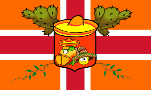
The fourth flag (2015-2016)
A variant of the fourth Nacho flag
After 57 days, Nachos leader Camper would replace Fluffy’s ensign on April 27, 2015. The flag was a part of a list of changes in the army, all present on the same post, like the retirement of Edd, and the promise of daily giveaways in their Xat chatroom. Reasoning aside, we still have a flag to decipher, even if the Nachonnians were discussing other changes.
The flag features a red cross bordered in white, overlaying an orange background, meaning something unique to the Nachos. The main emblem of the flag was also changed to a shield wearing a sombrero. The emblem features both a penguin and puffle in nacho attire, while cacti decorate the emblem.
So far, this is the most professionally built flag of them all. It manages to stay loyal to the Nacho identity while also creating something new. I feel like the use of red also made it unique, as other orange-themed armies like the Doritos were focusing more on yellow or white at the time. It sucks to have lost both mottos, but the cacti leaves a stronger connection to the Nachonnians than olive branches.
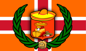
The final flag (2016-2017)
The fifth and final Nacho flag
Fluffy9404 would return to the history of the Nacho Army’s flag design in 2016, where he announced Nachos‘ last flag before closure. Fluffy would announce the final Nacho Nation flag on April 9, 2016. This flag would keep most of the previous details, but add some minor quirks to the flag.
Out of the main changes, the replacement of the cacti with the return of olive branches is the first visible. The coloring of the penguin and puffle being changed from lime green to red is a close second. They’re the main changes from the previous flag to this one, and items like the sombrero and cross remain.
I suppose it works as a more loyal version to the 2010 design. The return of olive branches wasn’t something I was expecting. The penguins being lime green was definitely something that needed fixing; the Nacho Army wear red penguins in-game after all. I would much rather be able to get the red penguins from one and the catci from the other, than have to pick either as my favorite, but I would probably pick the previous flag. The catci are just too good to pass. I will comment that this is the second time Fluffy has slightly changed a flag to his liking, which feels a bit harsh to the previous people.
The Nachos have carved themselves a catalog of not only universal symbols, but controversial symbols. From the fighting between the branches to the year with three flags, the Nachos have their list of flag stories to tell the world. Which flag was your favorite? Would you keep any of these flags in a Nachos revival?
PingoBoiii
Reporter