Dino has established himself as a cornerstone of the Club Penguin Army community and is celebrated for his impactful contributions. Famous for his innovative medal designs and beautiful thumbnails, he has solidified his place as a remarkable member. In this edition of Overworked and Underpaid, we explore Dino’s remarkable journey and highlight his significance in the army community.

Designed by Cassie.
DESIGNING CAREER
Dino’s graphic design career started in 2017 in a variety of online design forums and continued as early as 2018 with the community. However, in 2020, after being influenced by Koloway, a pioneering CPPS designer renowned for his army signatures and enthusiastic visuals during the Army of Club Penguin rebirth, he began to take his profession more seriously. For Dino, a key turning point was Koloway’s ability to engage the community and elevate graphic standards, even using tools as basic as Paint.net. Although he didn’t contribute much at the time, Dino first experimented with CPA graphics in November 2017 and applied to be a moderator on the Rebel Penguin Federation GFX team in late 2018. In 2019, Dino joined the Lime Green Army HICOM. During this time, armies often relied on outdated or subpar graphics, an issue that deepened Dino’s passion for design.

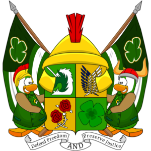
Dino’s favorite logo design displays the ACP coat of arms.
Growth and Approach
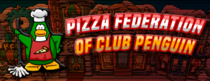
The late 2020 CPA graphics boom marked a turning point for Dino, where he built meaningful relationships with mentors like Zamb. Although Koloway was an early mentor and inspiration, Zamb officially took Dino under his wing in 2021 and assisted him in honing his approach. Dino also attributes his motivation around this time to Games, another gifted designer. His design philosophy adheres to the Ming-Zambi theory, combining his peculiarities with the lessons he learned from his teachers and designers such as Zeer, Tomb, and Dxdzn. He acknowledges that he is still improving in the areas of lighting, shading, and perspective, which are major themes in his work. Dino’s early mistakes, such as depending too much on effects in his early designs, like the Pizza Federation header, are what led him to advocate for experimentation and careful use of effects. In the past, Club Penguin Armies analyzed Dino’s art in depth as part of the Artistic Analysis column.

PZF header.
In July 2021, Dino undertook the Water Viking’s first significant redesign project including the Night Warriors header design. Although he was proud of the work at first, he now sees it as a first step in his development. Later, he had to learn perspectives and digital drawing, two new talents he is now honing, as part of his work with Zamb and Koloway on the overhaul of Club Penguin Army Headquarters. Dino’s CPA-centric approach has influenced much of his work, but he aimed to expand into more professional, sport-style designs. He advises aspiring designers to accept the learning curve, accept constructive feedback, and refrain from normalizing poor graphics. To comprehend the development of CPA graphic design, Dino also emphasizes the value of researching earlier designers like Ming, Tomb, Pochoma, and Stromae.

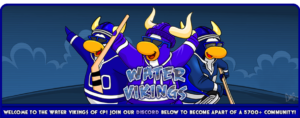
Dino designed the Water Vikings’ former website header.
A QUICK CHAT WITH DINO
Club Penguin Armies reached out to Dino to learn more about his journey in graphic design.
What was the most challenging phase of your design journey, and how did you overcome it?
Ahahaha, the most challenging phase is still one I’m in: perspective. I’m far better than I was in 2021 but perspective in my enemy. It’s a joke among me and Zamb that if I crack perspective I would be beating everyone (will happen in 2030 when Zamb is working a 7 figure tech job and CPA is maxing 5). Jokes aside, that’s the challenging phase. What I’ve done to overcome it is actually beginning to trace on paper and take my time. Otherwise, the pen tool was my enemy for the better part of a whole year but I’ve practically overcome it and that was through doing actual projects requiring using the pen tool regularly. Nowadays, I have an addiction to the tool. Sorry Zamb it took an ungodly amount of time.
Are there any designs that mark key milestones in your development as a graphic artist? If so, which ones?
The aforementioned NW concept and WV designs were big developments but my mainstream breakout was definitely my collab with Zamb with redesigning Zamb when I made the WV/IW penguins, the buttons, the server icon, logo, and other graphics outside of the header. I later got required to make the CPA org styling with Kolo and I made the header as well as the second Head of Branding heavily develop the styling guidelines (since me and Kolo co-created it).
Looking back, how do you feel about the growth and progress you’ve made in GFX design?
Job’s not done. I’m happy I’ve gotten a lot better since 2021 but I’m not content at all. I’ve had to shelve a lot of designs due to motivational issues. There’s also that perspective issue. I’ve felt I’ve grown significantly but I have so much more to grow regarding that and that’s my goal for this year (make my own website design by myself and actually follow through in making a top ten design).
Dino’s graphic design career exemplifies the value of mentorship, perseverance, and constant improvement. From his early days experimenting with effects to his present work perfecting digital drawings and perspectives, he is constantly striving to better himself. His advice to aspiring designers is straightforward: accept learning, push yourself, and never settle for mediocrity. His experience demonstrates that with dedication and the correct training, anyone can improve their profession. What do you think drove Dino’s growth as a designer? What lessons from his story resonate with you?
MtJordan II
Senior Reporter