
The Army of Club Penguin, the oldest founded army, will mark its twentieth anniversary in just a few months. As a result of this rich history, several instruments of symbolism and value have developed throughout ACP’s existence. Originating from the Miniclip forums, many people have tried their hand at capturing the increasingly complex history of this historic giant. In this edition, our goal is to explore the 20-year history of Club Penguin’s first soldiers.
Designed by Dino
Flags and Army Identity
Flags are an essential part of geopolitics. Especially in terms of national identity, they play a crucial role. In this case, it would be more appropriate to refer to it as ‘army identity’. Nevertheless, flags can be a strong symbol indicating the connection of an individual to the greater group. This being part of something is essential for an army’s unity and performance. Hence, flags have great potential in shaping the identity of an army, particularly in establishing a sense of pride. But also for the formation of hate against the foe, they can be effective.
Most of the time, flags are overlooked as just a small part that makes up the army as a whole. Usually disregarded, they are likely the first thing individuals will associate with and note about a particular army. Members of an army have often been confronted by various means of symbolism used in such a context. They have likely felt the impact symbols can have in a community, even for a community as small and niche as a Club Penguin army.
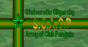
First flag (2007-2008)
Display of the first ACP flag
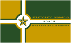
During the Army of Club Penguin early days, the first ACP flag; and one of the first army flags, if not the very first – was created in 2007 by founder Oagalthorp and remained in use until 2009. It features a design based off a cross with the use of alternating green and gold corners. In the center of the flag, a circular design was added to fit a star of unknown symbolism.
To its right, we also see the newly made full name and acronym of ACP, “SOACP” (Stratocratic Oligarchy of the Army of Club Penguin). The flag also includes a white border; however, it might possibly have been a mistake due to the low quality of the flag. This flag shows a really clean and simple design. It had issues, like being devoid of any specific meaning, and the use of text on the right greatly diminished its quality. It definitely worked for something made in 2007 and would see its return in the future.
second flag (2008-2009)
Display of the second ACP flag
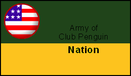
Information on this flag is incredibly scarce, as it was announced as an option in a 2008 flag contest hosted by Fort57, though it already pre-existed. It was made in 2008 and retained its title as ACP’s flag until a new vote was held the previous year. It features a black border with a green and yellow bicolor-legitimately more green than yellow-with the words “Army of Club Penguin” on top and “Nation” below. In the canton, there is a Club Penguin pin of the US, likely representing the US leadership of ACP. It is definitely an attempt, to say the least. The font appears uneven and glitchy in parts. The inclusion of a Club Penguin pin with completely different colors also stands out. Overall, this represents a significant downgrade from its older counterpart
third flag (2009-2013)
Display of the third ACP flag
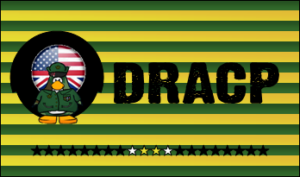
The third flag to serve ACP also came from a flag contest, just like in 2008. Originating from a contest vote on April 21, 2009, which ended two days later, the winning submission was made by Kid Robot, after beating submissions from Mitch and Flappy2558. It includes a horizontally striped background of green and yellow. It features 20 stars at the bottom, with ACP’s full initials, “DRACP” (Democratic Republic of the Army of Club Penguin), written in bold. To the left, it includes an icon of an American/British flag displaying an ACP penguin, all contained within a black circle. There was at least an attempt at making a cohesive design, but many elements fall flat.
Considering its creation over 16 years ago, as well as its more iconic status during ACP’s OGCP Golden Age, older viewers of Flag Frenzy are aware that issues such as the faulty black circle, non-professional fonts, and a general lack of symbolism outside of the army theme are common for this stage of the community. It stands for its time and is generally an inoffensive flag that is rough around the corners. Its extensive use over the years cannot be overstated. It had staying power during a time of massive growth for the CPA community, which made this flag really stick. Even during years when the army legally decommissioned it, members still frequently used the flag as a throwback to ACP’s history: an achievement few flags in the community can match.
fourth Flag (2013)
Display of the fourth ACP flag
Capncook unexpectedly cut the previous flag’s time short with a surprise announcement. ACP held a new flag contest from June 3 to June 13, 2013, and returned the previous flag for use during the vote. As a fun fact, ACP also brought back the first flag for 10 days.
fifth Flag (2013)
Display of the fifth ACP flag
This flag was the winner of the contest. Made by PurpleSlime4, a future ACP temporary leader, it had the mission of replacing one of the most recognizable flags in the community. The flag consists of a camouflage background, with a tricolored cross of brown, green, and bronze-yellow extending to a green star on the hoist side of the flag. Like its temporary predecessor, it also includes “SOACP” in bold along with its full name. However, this time the text was green, with SOACP featuring yellow gradients-definitely a downgrade by convention.
The harmony of the previous tricolor was replaced by a mostly muddy green design, with hard-to-read text. This flag would shortly fall out of use, likely as a consequence of its contest imposer, Capncook, retiring later that month. Kid Robot’s flag was returned to use, likely due to how iconic it had become. It also did not help that the flag had already been replaced less than a month prior, twice.
sixth flag (2013-2015)
Display of the sixth ACP flag
As explained, this flag returned to use shortly after the placement of Capncook’s and Purple Slime4’s flags. It would last for 2 more years until changes in ACP decided to stop its use.
seventh Flag (2015-2017)
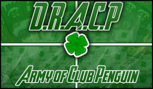
Display of the seventh ACP flag
The Club Penguin community evolved as a whole during the mid-2010s. After a failed flag contest in 2014, 2015 saw the adoption of a brand-new ACP flag, this time breaking away from the previously basic symbolism of soldiers and camouflage. The new design ditched horizontal stripes for a mostly green design, removing gold from the flag entirely. It features a picture of an ACP event, while a thin white cross was added.
For the first time, the designers placed a clover at the center of the flag as a symbol of ACP. They kept the acronym ‘DRACP’ and moved it upward, while adding ‘Army of Club Penguin’ at the bottom. They applied several shadow, gradient, and lighting effects to polish the new design, and they added a small black border to the flag
It does not exactly follow the do’s and do not’s of flag design, but it is a nice break from the previous designs. The addition of the clover feels clear now, especially for its uniqueness compared to the mirage of stars. Beforehand, there was not a simple symbol for the Club Penguin arms to adopt, and this flag has definitely affected ACP-indirectly at least, as its use was mostly limited to its time. This flag also marks the end of ACP’s presence in the OGCP community, with the game shutting down during its use. ACP chose to shut down, only returning two years later for their birthday in 2019.
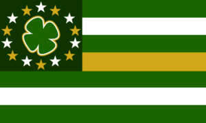
eighth Flag (2019-2023)

Display of the eighth ACP flag
After a two-year shutdown, ACP returned to the community in 2019, with their return prompting the creation of a new flag. Made by Koloway, it was used for four years until another flag controversy-this time involving Elite Guardians tarnishing Koloway’s design during the Centenary Solstice War-led to a flag contest being held to replace it.
It was the first flag to feature a canton, a dark grey one, while thirteen darker and lighter green horizontal stripes were added, similar to the real-life flag of the United States. A coat of arms was added to the canton. Off-centered to the left, it features likely olive branches across a large clover displaying the initials of ACP and its name, written in grey. A neat detail is that the grey text also features an ACP event, similar to its predecessor.
There are some minor flaws that severely hinder its likeness. The gradients on the stripes, while possibly a reference to the first DRACP flag, clash with the plain design. Essentially a reskinned version of the US flag, the coat of arms being legitimately to the left was upsetting when first seen. This flag was also the final nail in the coffin for yellow in ACP’s color palette.
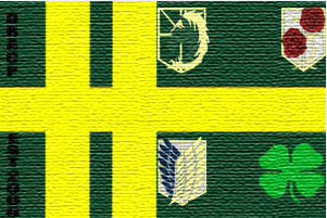
current Flag (2023-)
Display of the current ACP flag
On October 5, 2023, ACP announced the results of its flag contest, revealing that 3rd-in-Command Dino had won with his flag. This flag had high ambitions from its creator, coming with its own emblem, which also won its respective contest. This flag is also special because there is no need to speculate about its meaning, as Dino has made its meaning public.
The flag displays three major colors: green, white, and gold—each carrying a distinct meaning: green represents virtue and patriotism for the DRACP; gold symbolizes prosperity and freedom from oppression; and white reflects both the snowy in-game environment and the ideals of justice, with green and gold drawing from traditional ACP colors. These meanings also relate to one of ACP’s most well-known slogans, “Defend Freedom, Preserve Justice.” In the canton, 14 stars are placed to represent 14 historic ACP servers, with a Shamrock Clover in the center. It features seven stripes, representing the seven World Wars ACP took part in, meant to also stay in line with the US-centric design of the previous flag.
Absolute. Cinema. Real-life flags have been seen with less meaning than in the current design. This flag not only looks like an ACP flag, but also manages to incorporate so much ACP history that it deserves its title. As a graphics team juggernaut, Dino was also able to deliver in the flag community. Despite some of its symbols being related to time, it has ended up being a timeless solution.
bonus Flag (2014)
Display of an ACP flag contest winner
In 2014, ACP hosted another flag contest to decide its future design. What made this edition different was that the winning flag would need approval from the ACP Commanders to become the official flag. Aeropos likely designed a flag that the authorities didn’t approve, so they included it as a bonus flag. Nonetheless, I still found it interesting enough for a review.
The flag is composed of a yellow double vertical cross on a green background. The hoist features the text “DRACP EST. 2006,” written top to bottom and intersected by the horizontal line in black. On the right side, there are four symbols: three representing ACP divisions (as they exist today, 12 years later) and a four-leaved clover at the bottom right, symbolizing ACP as a whole. The flag also displays a noticeable texture pattern to mimic real fabric, a rare feature in this community since creators seldom print flags
This flag was nearly the first ACP design to include the four-leaved clover that has since become ACP’s most recognizable icon, predating the 2015 design. However, its disorganized layout likely prevented it from ever becoming official. Black text on forest green and the awkward placement of the four symbols- one of which even cuts off at the edge—severely undermined its appearance. It’s unsurprising that this flag remained on the drawing board.
The Army of Club Penguin has created a vast catalogue of flags and symbols. The army has maintained a distinctive identity throughout its two-decade history, even while members debated what an ACP flag should look like. What do you think of their designs? Are there other armies that deserve a spot in Flag Frenzy?
PingoBoiii
Reporter