
Across the CPPS era, armies have often participated in world maps. The last CPA map was launched last year, but how is a map made? Join me as I explain what went wrong in the current map and how it should have actually been made.

Designed by Edu14463
For many, the map is just a board where we display the land our army owns. It is an ego booster, a place where we can see our army’s achievements. Yet, for those of us behind the scenes, it is months of coding, debating, and designing. I have worn many hats in this community (Army Leader, Head Judge, Editor), but sometimes the most intriguing battles are not in the field. They happen in the development logs.
THE WAY IT SHOULD WORK
To understand where things went wrong, we have to look at where they actually went right. In 2021, I worked on the Club Penguin Army Headquarters map.
CPAHQ Map (UI by Flen and Superhero123 | Design by df44)
After the successful run of CPAHQ’s Project: Conquest, the community demanded a new territorial map. While Club Penguin Army Network focused on having a traditional map (masterfully implemented by F6) inspired by Commando‘s Map legacy, CPAHQ wanted to experiment with new ways of implementing something fun. So, the goal was to introduce the concept of renaming servers from P:C for the new map. And it worked.
The process here was structural and sane. We had a division of labor: I focused on the geography (design), while Flen and Superhero123 handled the user interface (coding). I did not have to worry about backend logic. Because of that synergy, the map was cohesive. Although it had its flaws, it worked for a pretty good amount of time.
THE BREAKDOWN
The story completely shifts with the current Club Penguin Armies map. Announced in 2024, it was supposed to combine the Army Representative’s ideas after long sessions of discussion between the CPA Administration and the armies involved.
What was supposed to be a team effort to deliver a new map complying with the new requests quickly dissolved as people kept dropping the project. I was functioning as a one-man studio, forced to reconcile the visual design with the actual coding implementation, all while managing my life outside of armies. Yet I could not leave a project that was doomed from the beginning, and I kept going.
For those who don’t develop, I want you to understand: coding a map is not just uploading a picture. It is connecting a “database” to a user interface, managing territory logic, and debugging live errors. Doing that alone is difficult. Doing that alone while fighting a bad strategic mandate made it impossible.
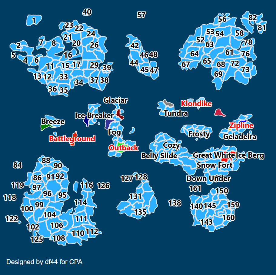
Concept for the current CPA Map
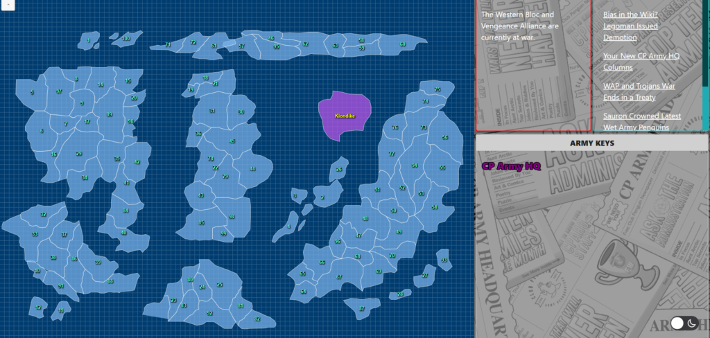
To be fair, the biggest flaw with the current map was what it was required to be. And, to be clear, I never agreed with the army leader’s decision to implement 250 servers.
During the planning process, I warned the administration. I argued that developing a map of that scale was insane. But, more importantly, it was suicide for the league’s activity. A map is a funnel for conflict. If you make the funnel too wide (250 servers), armies rarely collide. The result is what we have now: a dormant map with little to no warfare.
I tried to use the design process to mitigate this. I introduced multiple continents and combined them with legacy servers that were, because of the map, coded into CPAB to try and force the return of patrolling and natural conflict. Yet, I admit that the final UI was rushed and looks confusing to some, as I was already tired of the whole backend process and had exams coming along.
Ultimately, there were rumors later that I held onto assets, but the truth of the process is simple: I handed over all my files so the project could continue. And later on, Chicc did code the remaining aspects, such as editing servers and such. I joined with the best intentions, but, in the end, a map built on a flawed foundation cannot stand.
FINISHING THE JOB
Designers and developers rarely get enough recognition in this community. We spend our time in code editors and design apps so that you can have appealing websites, functional bots, and even a place to battle.
That is why, when I heard CPA was starting a new map process with a design led by Dino, after the Admins reached out to me, I agreed to return. I saw an opportunity to fix the process.
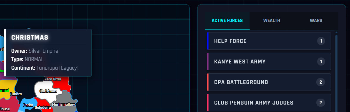
Sneak Peek of the new CPA Server Map (UI by df44 | Design by Dino)
I rejoined the dev team to “finish the business” I could not finish last year. This time, the geography is smarter, the rules are better, the code is more robust, and the design is polished. We are not just making a map; we are aiming to build a more functional war room.
In a few weeks, we will finally be ready to give this community the map they should have had.
df44
CPA Developer
More Information

CPA Wiki Admin | CPA Developer | WV Advisor
I approve!