The story of strong symbology is not limited to flags. Armies may pick other symbols, such as coat of arms, to unite their identity against rival armies. Certain armies, however, have been reluctant to create a flag, such as those we will discuss today.
Designed by Dino
Flags and Army Identity
Flags are an essential part of army geopolitics. Especially in terms of national identity, they play a crucial role. Nevertheless, flags can be a strong symbol indicating the connection of an individual to the greater group. This unifying force is essential in promoting armies. Hence, flags have great potential in shaping the identity of an army, particularly in establishing a sense of pride. But also for the formation of hate against the foe, they can be effective.
Most times, flags are overlooked as just a small part that makes up the army as a whole. Usually disregarded, they are likely the first thing individuals will associate with and note about a particular army. They have likely felt the impact symbols can have in a community, even for a community as small and niche as a Club Penguin army.
ARMY ONE: HELP FORCE
The Help Force have been around for 7 years now, marking their debut in 2018. The Helpers however, became an exception in the community, by not using a flag, but rather a badge.
First HF Symbol (2018)
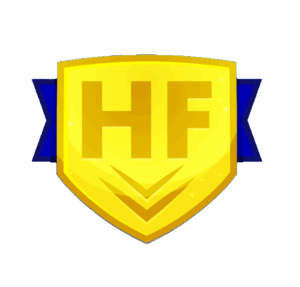
Current HF badge
Help Force’s first badge was made in 2018, shortly after their foundation, as proven by their website posts. It is a simple badge, being based off the crest present in the chest of their uniform, which was likely inspired by sport emblem culture. It has the armies’ initials of “HF” written in bold, with two stripes directly below as a stylistic choice. Another key feature is the blue ribbon that peeks outside of the badge itself, with the design itself featuring a gradient.
Despite being a simple icon, likely made to be consistent with the armies’ uniform, it has held up over the years. However, Help Force has decided to rotate its usage with some other badges. We will now look at these alternatives.
Second HF Symbol (2023-)
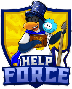
Display of a current HF Badge
This new symbol heavily improved upon the previous badge, adding the Help Force Penguin, as well as making the army’s title more obvious. The badge kept its yellow colour, but the blue ribbon has been replaced with a thick blue outline. The yellow badge itself now looks considerably shinier with a new holographic-like background, featuring a forest as a stylistic choice. The penguin also holds a guitar on his left arm, a part of the HF uniform, a stamp book on his right arm, a reference to one of Help Force’s most common events, and has a puffle on his shoulder.
This crest of far more intricate compared to its older sibling. While the older badge is the more popular one, even being used in Legends Cup XV, the more recent design not only shows more depth, but also more flag-like characteristics. It is similar to other countries with complicated coat of arms, just lacking the flag aspect.
ARMY TWO: SCARLET REPUBLIC
Entering the community earlier this year, the Scarlet Republic have become a mainstay in the S/M community. Founded by Ghostt and Imvge, the republic remains flagless to this day. Let us investigate what they use instead.
Scarlet Republic Symbol (2025-)
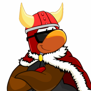
Display of a current SR Portrait
Taking the idea of focusing on the uniform to the extreme, the Scarlet Republic have decided to ditch any auxiliary symbols whatsoever. This portrait of the SR Penguin has become synonymous with the army’s image.
The SR uniform includes a black letterman jacket with brown sleeves, a red cape, red viking helmet and sunglasses. As a result, the Scarlet Republic, associated with red due to its namesake also highlights complimentary colours.
ARMY THREE: STAR FORCE
The Star Force arrived to the community in June 2025, and immediately made an impact on the community. Nearing their first anniversary, SF still remains flagless to this day. However, SF have replaced the flag symbology with something peculiar.
Star Force Symbol (2024-)

Display of a major SF symbol
The Star Force has mostly focused their brand on their blue headphones. As an army who rarely host Club Penguin Army Battleground events, wearing the colour blue is crucial to identify members in-game. With the headphones being from their CPAB uniform, similar to other head items covered here, the blue headphones have left their mark on the developing army.
It is not an exactly creative choice to use a sole item of your uniform as your logo, however, it has proven successful for the Star Force.
WHAT IF THEY HAD FLAGS?
Despite these aforementioned armies not having a flag to speak of, there is certainly potential. As such, here are some examples of what flags could look like for these armies. As always, following the rules of designing a flag are essential. These rules are: Keep it simple, use meaningful symbolism, use two to three basic colours (or at least respect the rules of tincture), and be distinctive to other flags.
HF CONCEPT FLAG
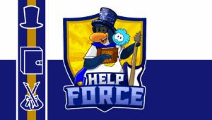
Display of HF Concept Flag
I decided to start making this flag by using a bicolor isntead of the more common tricolor. I did this to mimic HF’s regular uniform of a white shirt and blue shorts, while keeping the crest represented by keeping one of the Helper’s badges in the flag. A stripe to the left of the badge was added to add more color aswell as enforce some of the most common symbology present. Also got to add three symbols into the left bar. A blue top hat, as is it one of HF’s most recognisable parts of their uniform, a Stamp Book to represent their stamp events, and two Guitars clashing against another, to represent battle.
This flag employs use of a bicolour, to reflect the Helpers outfit colours. The HF crest has been retained, with a stripe on the left featuring key symbols to the army. These include the famous blue top hat, a stamp book, and a guitar from their uniform.
sr CONCEPT FLAG
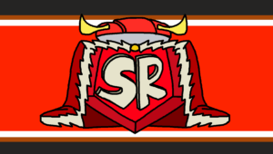
Display of SR Concept Flag
As this is the Scarlet Republic, the scarlet background of the banner takes central stage. Stripes of black, brown, and white were also added, to reflect the army’s jacket. To create a “central symbol”, a scarlet gem of sorts was employed, with the letters SR included. The emblem itself features the red robe and viking helmet worn by SR.
sf CONCEPT FLAG
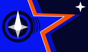
Display of SF Concept Flag
This one is by far the most abstract of the three. The challange here was to try to make the flag represent stars, and not just space. This was achieved by using the star’s silhouette to create a penguin adjacent creature, with the blue headphones simplified to resemble eyes. A star was added at the top right corner to represent unity, specifically to unite the Club Penguin Journey and CPAB members. Originally this flag was horizontally mirrored, but this imperfection makes the flag unique. The flag produces the idea of “following the stars” and leadership. The mostly blue and some orange and white colouring was taken directly from their uniform.
The flagless community of the Club Penguin world has definitely left some interesting replacements. With most recurring to things like uniform items, it produces several questions of what could have been. What do you think about these symbols? Should they be replaced with any of the flags concepts shown today?
PingoBoiii
Reporter