
The small/medium army community has long been a core part of Club Penguin Armies. Whether rising to major status or stirring up fun as joke armies, small/medium armies have always made their mark. including through their unique flags. To kick off Flag Frenzy’s first post of 2025, let’s take a look at how S/M flag culture has evolved.
Designed by Dino
Flags and Army Identity
Flags are an essential part of geopolitics. Especially in terms of national identity, they play a crucial role. In this case, it would be more appropriate to refer to it as ‘army identity’. Nevertheless, flags can be a strong symbol indicating the connection of an individual to the greater group. This being part of something is essential for an army’s unity and performance. Hence, flags have great potential in shaping the identity of an army, particularly in establishing a sense of pride. But also for the formation of hate against the foe, they can be effective.
Most times, flags are overlooked as just a small part that makes up the army as a whole. Usually disregarded, they are likely the first thing individuals will associate with and note about a particular army. Members of an army have often been confronted by various means of symbolism used in such a context. They have likely felt the impact symbols can have in a community, even for a community as small and niche as a Club Penguin army.
ARMY ONE: SPECIAL WEAPONS AND TACTICS
The Special Weapons and Tactics is the oldest case study that we will focus on, having been created in 2009, the army has found itself with a catalog of flags and symbology that have represented it as a result.
First Flag (2009-2017)
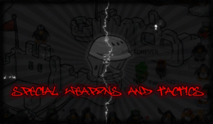
Display of a reconstruction of the first SWAT flag
SWAT had a rocky presence during the early days of the community. Beginning in 2009 until its first shutdown in 2014, SWAT would reopen 4 times until its closure in 2017. This flag is the only one to have survived its era, as the reopenings made it difficult to find proof of others.
It shows one of their most iconic symbols, the snowboard helmet, surrounded in an image of one of their events, tinted in black, while you see “Special Weapons and Tactics” written in red and a smoke effect dropped onto the design, roughly in the middle.
It doesn’t take much to tell someone that this flag was used before the shutdown of Club Penguin, as the Agents were still finding their footing, this flag stood upon them, and while it looks like a poster made in 2009 and not necessarily a flag, it worked for them.
Second Flag (2020-2021)
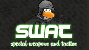
Display of the second SWAT flag
When the pandemic hit, SWAT decided to reopen its doors to the community, having its first event less than a month after the lockdowns began. But during this revival, their leadership decided to switch its historic flag to an inspired, yet more modern design.
Replaced is the image that is behind the icon, and so is the icon itself, with the snowboard helmet morphing fully into the SWAT penguin, adding “SWAT” to the flag’s design. The fonts on the flag changed to a sleeker font, and their coloring switched from a clear red to white with a green contour.
This flag feels like a poster, but knowing the history of the design, it more or so feels like a remaster of the previous design. The only major difference worth noting is how the images don’t clash with each other as much. This flag lasted until 2021, when another reopening marked its end.
Third Flag (2021-2024)
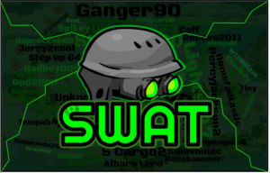
Display of the third SWAT flag
Compared to its previous version, this flag lasted just slightly longer, by a year. But this flag would add some major changes to the ensign. As SWAT started to reflect a change in leadership, the Agents would solidify during this period as a consistent small/medium army. It was with this flag that most of SWAT’s modern-day history would occur.
First off, you can see that the flag contains another image of a SWAT event, but this time tinted in a darkish green instead of black. It has the names of historic SWAT members engraved onto the flag, with the return of the snowboard helmet, whilst also giving it dark vision goggles. This flag shortens SWAT’s full name to its initials. This flag represented a shift in their coloring, switching the red-lime-black tricolor to a majority lime scenery.
All three flags so far have achieved the same representation goals, whether it’s down to the colors, the uniform items, and the showing of strength by using a SWAT event in the background, and this specific flag’s usage has made it the most iconic SWAT flag to be used today.
Current Flag (2024-)
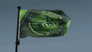
Screenshot of a commonly used GIF of the current SWAT flag
Ever since SWAT’s Operation: Phoenix during December of 2024, the Agents have switched to a sleeker and flag-like design compared to their ancestors. Just like its previous flags, it was designed by former SWAT leader Legoman.
The flag displays shades of black and lime green, but also introduces a fimbriation (diagonal line) in the center stage. As a result, the entire flag design is based around it. The inner diagonal stripe is a variant of the snowboard helmet, which SWAT has added many times. It also has a circular design featuring “Special Weapons and Tactics” written across. It sits next to a barrage of stars of unknown logic, and two crosshairs at the top and bottom. The flag represents a black background with light green details overall.
Out of all its different variations, this flag represents the most traditional viewpoint of flags, representing yet again the colors of the army, and the uniform of the army, standing high after over 15 years of establishment.
ARMY TWO: PEOPLE’S IMPERIAL CONFEDERATION
The People’s Imperial Confederation, or just PIC for short, was created in 2019 after a series of rebellions from the Recon Federation of CP. PIC would later on challenge the S/M community during its active years, reaching major status in 2024. With more than 5 years of experience under their belt, let’s see if PIC has had time to formally prepare their ensign.
Current Flag (2019-)
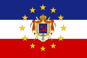
Display of the current PIC flag
With its flag being made in October 2019, just a week after the army opened its doors, PIC has remained loyal to its design. With its tricolored bars that have stuck with the army since the beginning, just what elements hide within this design?
The flag has a tricolor with a coat of arms. The tricolor has the same colors as the coat of arms, using blue, white, and red. The coat of arms displays the communist hammer and sickle in bright red on a blue background, situated on an imperial coat of arms. The coat of arms is surrounded by stars similar to those present in the ensign of the European Union.
This flag has left its mark on PIC, as it has been cherished as part of their identity, managing to represent both the uniform and branding of the army, unlike some armies in the community that rely on their colors to make their design. PIC has created a flag with big shoes to fill if they ever decide to retire this one.
ARMY THREE: THE BASTILLE VANGUARD
The Bastille Vanguard is a relatively new army. They’re yet to have their first anniversary event, but have made good use of their flag iconography. But just how did the Vanguards evolve their flag and symbology?
First Flag (2024-2025)
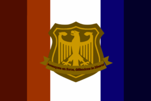
Display of the first TBV flag
The first flag to be used by the Bastille Vanguard was designed by the army’s creator and leader, Aucraia. It has the curiosity to be the first flag to present a war cry in our case studies.
The flag features a French-inspired tricolor, but altered into 5 bars of alternating lightness, with a coat of arms sewn into the middle, which has an eagle in the shield and a motto featuring “Avançons en force, défendons la liberté”, which translates to “Storming forward, defending freedom”.
This flag manages to stick out from the others. Using strong dark colors, the white stripe makes the coat of arms pop from the rest of the flags seen today. While the motto written in red on dark yellow is odd, it has built the basics for TBV.
Current Flag (2025-)
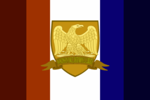
Display of the current TBV flag
Aucraria also designed this flag. The current flag might be mistaken for its predecessor at first sight, but there are some noteworthy changes since its publication in February.
The coat of arms changed from a Germanic eagle to a Neapolitan eagle, used by the French during the Napoleonic Wars. The motto’s ribbon is now taller, with its text changed from red to yellow. The flag continues to take inspiration from its French basis, as the reversed French tricolor is still present. The current TBV flag has survived its hiatus, proving its longevity.
The flag overall has its improvements. While it isn’t as iconic as the last, it still fills the boots that the old ensign left. The new emblem gives a fresh coat of paint while also still feeling like a flag for the Vanguards.
ARMY FOUR: PENGUINS OF AGARTHA
The Penguins of Agartha are one of the newest armies to be mentioned, being created in March 2025. They were originally called just Penguins of CP, but had to change due to investigations revealing that said name was already used. Let us take a look at this army’s flag.
First Flag (2025)
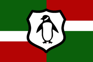
Display of the first PACP flag
The Penguins of Agartha flag was designed by stv, a former advisor and current PACP leader. Although at first sight, there may be little meaning, there are still some aspects worth noting.
Designed before the name change, the flag features a crooked tricolor that alternates color patterns. The flag goes green-white-red on the left but red-white-green on the right. A crest with a penguin is placed in the middle of the flag, representing the proposed Penguins of CP name. The flag’s middle stripe balances out the green and red. The flag has the interesting aspect of not being centered. With its left side slightly longer than its right side, this flag has more green than red.
It’s a simple design that manages to encompass the colors and meaning of the army. The flag did not change after the rename, as its basis, the uniform, didn’t change.
Current Flag (2025-)
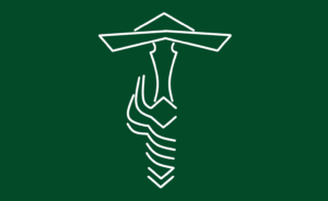
Display of the current PACP flag
Sadly, for the previous banner, the Penguins of Agartha did not choose to keep it. A new flag would be designed by request in June by current Water Vikings troop, PingoBoiii.
This flag takes inspiration from the current WV flag. It replaces the penguin with a design based on the swords and newspaper hats equipped on PACP’s uniform. The green background represents a change in their coloring, ditching the red-white-green for mostly green.
This design cleans up a lot of the previously undefined details. It chose to focus on reasoning instead of the “flag = army colors” ideology very common in the army scene. It sticks out as a simpler, yet more elegantly designed, compared to others seen today.
The small/medium community created a vibrant barrage of vexillological diversity. While the CPPS S/M community has stood by their identity, early S/M armies kept up with their history and symbology. What do you think about their flags? Are there other armies that should be mentioned in Flag Frenzy?
PingoBoiii
Reporter in Training