In Overworked And Underpaid, we aim to interview designers, get to know more of them, and have them share their journey and design advice. As we inaugurate this column, we sat down with Master DS, our dear Head of Branding.

Designed by Cassie
Master DS’s journey into graphic design was not the most glamorous compared to some other artists, but it has been meaningful in its way. As a kid, she always liked to draw, though it was nothing fancy back then. Nonetheless, the real spark came in fourth grade when she stumbled upon a French comic book with a manga-like style and vibrant colors. That comic quickly became one of her favorites, inspiring her to pick up a pencil and start improving her skills. On top of that, as she grew up playing MMORPGs like Club Penguin, Fantage, and Moshi Monsters, those games got her hooked on graphics and creative visuals. However, she did not get serious about it until late 2020, when her army career started, and she began drawing penguins.

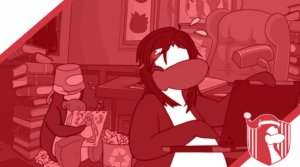
One of the most stunning thumbnails designed by Master
When she first joined the Rebel Penguin Federation, Master was just finding her footing in the community. She mostly focused on showing up for events and was not super involved in the wider scene, even though she had seen plenty of leagues come and go over the years. Her real love for graphic design kicked in about a year later, during the heyday of Club Penguin Rewritten. She spent hours scrolling through the art channel on CPR’s Discord, soaking in all the fan art, the different styles, and the amazing colors.
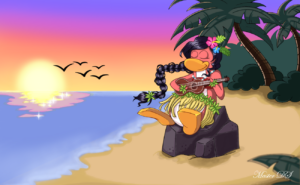
That was when she decided to try making something herself. Thus, her first serious piece was a penguin drawing of her old officer mentor, Lanie. To this day, it is a work she is proud of. “I still feel butterflies every time I see that drawing”, she said. From there, she started doing penguin art here and there for projects on her server.

Master’s first penguin art
The big turning point came when Koloway offered her a spot in Club Penguin Armies‘ graphic design department upon its inception. That was when things took off. Therefore, she dove into graphic design, learned new techniques, and kept leveling up her skills. Over time, she worked her way up to become Head of Branding in 2023. What started as a kid messing around with basic drawings turned into a full-on passion for design.
A QUICK CHAT WITH MASTER
We sat down with Master to learn more about her career as a designer.
Could you tell us more about how you learned to use virtual designing softwares?
Like all aspiring artists, I started my journey on paper for the longest time…mostly because I never had access to a computer of my own. And when I finally got one, I went to the very first software that all artists start with: MS Paint. I remember sometimes spending hours on one picture alone with a mouse until it became so tedious that I just gave up on it in the end. And then I got my very first ipod, where I downloaded the very software that I use to this day: Autodesk Sketchbook. This app became my best friend during the long hours in PE during high school, where I would twirl my fingers on the blank page drawing characters from my favorite comic book. And then finally, I got my very own touch-screen laptop with its own digital stylus, which allowed me to fully embrace my artistic abilities using the medium I was comfortable with: a pencil and paper. For those of you that want to know why I never bothered to learn Photoshop despite that it would ease a lot of graphics designing aspects, well let’s just say that I first took a look at it during my sophomore year in high school and quickly said nope afterwards; PS was simply never for me XD
What about your job as CPA’s Head of Branding? What do you like about it and in which aspect is it challenging?
Becoming HoB was definitely one hell of a transition itself, since beforehand, I simply did graphic requests as assigned and didn’t have to worry about the organization in the background for all tournaments/parties in CPA. That all of course changed when I became Head, as I now had access to the behind the scenes when it came to preparations for any tournament or party in the community. While I still do graphics assignments here and there, my workload did increase as I was now responsible for every decision making about palette, logos, thumbnail styles, server decorations, etc. It can be overwhelming at times, but also fun and fulfilling!
You are also a CPA Battleground designer, right? Could you tell us about your job there?
Yeah I am 😄 . So my job as a designer for CPAB mostly consists of decorating the rooms on the island for tournaments/seasonal holidays. I’ve also been its main designer for a while, so the workload can be a bit much at times. Thankfully, I’ve gotten some help recently with a new addition to the team, so things have been going a bit more smoothly in terms of cranking out rooms on time for tournaments. One other perk of this job is also being able to constantly bully Super in DMs, so that’s great too (luv u super 😘 )!
Lastly, what advice would you give to someone who is aspiring to become a designer like you?
First, I would recommend finding your style, what works for you. One of the things people tend to tumble over is they try to copy what they see online and they get confused about why it doesn’t come out right. The most important thing is to be open minded when doing graphic design because there are multiple ways things can go together. Second, make sure to experiment with different design softwares and see which one work best for you as finding the best medium can greatly impact your work.
A ROUND OF ADVICE
To wrap up, we asked Master to deliver us a quick tutorial on designing in a software she uses. Here is what she prepared:
How to recolor a layer in Autodesk Sketchbook?

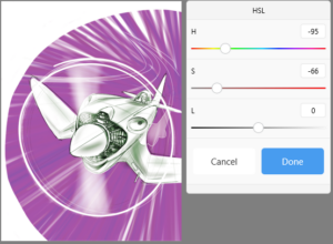
HSL panel in Sketchbook
Graphic design may seem easy to the untrained eye, but many skills need to be learned before one can create some beautiful artworks. One of the most skills to learn is how to recolor a layer; now there are probably a multitude of tutorials on how to do so on software such as Photoshop, but let me show you on how to do on the most basic of of apps, like Sketchbook:
1. So what really controls color in digital art is not the pigment, unlike in painting, but the HSL, which is an acronym for: hue, saturation, and lightness. These define the three values of a color.
2. There are two ways to change the color of a layer. The first method is something you can even do in MS Paint: use the paint bucket or “Fill” function. You go to your color editor, choose a color, and click on the bucket to recolor any object you want in your drawing.
3. The second method is something that is no doable in MS Paint, and that is the “Color Adjustment” function, which you can access from the button with the three circles on the top menu. Clicking on that will open a window where you can individually. The hue number represents the angle on the color wheel from 0 to 360, which determines the color itself. The saturation, from 0% to 100%, determines the shade of gray the color will have, 100% being the full color. Finally, the lightness determines how light the color is, represented as a percentage as well, where 0% is black, 50% is neither light nor dark, and 100% is white. Toggling with those three values can adjust and create colors. However, be careful when you change any of those values as any object within the layer you want to change will change as well, so be sure you have the object you want to change alone in that layer.
Learning more about our dear designers’ journeys is inspiring and captivating, without a shred of doubt. We hope you had the opportunity to get to know more of Master’s artistic side and even get yourself interested in drawing. Thank you, Master DS, for your time and service in CPA! We wish you good luck as you continue your path as an amazing designer. Are you going to try your hand at graphic design? Who would you like to see applying to the department? Did you also fall in love with Master’s first drawing?
Edu14463
Editor-in-Chief