
The Rebel Penguin Federation is one of the oldest armies in the history of the game, capturing the attention of many. With this, you could assume, comes a large variety of different symbolism, but is this really the case? To answer this, let’s dive into the different flags and meanings of this tradition-rich army in this new edition of Flag Frenzy!

Designed by Dino
Flags and Army Identity
Flags are an essential part of geopolitics. Especially in terms of national identity, they play a crucial role. In this case, it would be more appropriate to refer to it as ‘army identity’. Nevertheless, flags can be a strong symbol indicating the connection of an individual to the greater group. This being part of something is essential for an army’s unity and also performance. Hence, flags have great potential in shaping the identity of an army, particularly in establishing a sense of pride. But also for the formation of hate against the foe, they can be effective.
Most times, flags are overlooked as just a small part that makes up the army as a whole. Usually disregarded, they are likely the first thing individuals will associate with and note about a particular army. Members of an army, often have been confronted by various means of symbolism used in such a context. They have likely felt the impact symbols can have in a community, even for a community as small and niche as a Club Penguin army.
First Flag (2008-2010)
Enhanced original of the first flag of the RPF
The first flag of the Rebel Penguin Federation features a design already very familiar to what we are used to. It was created in 2008, one year after the founding of the army. However, it was only in use for 2 years until it was changed. A diagonal tricolour, it features the colours commonly associated with the RPF: black, red and white, arranged in order from hoist side to fly side. Atop, the army symbol (as it is declared to be called) is placed, alongside the text “U.S.R.P.F.” proudly presented below. However, note that the army symbol is only decorated by a singular red stripe at the bottom, different from what we know today.
In meaning, the colours and symbols tie off the elegant design of the flag. Black, being the first and hence the most important colour, proudly representing the colour of the RPF itself. The large red middle stripe is boldly showing the power of the RPF, according to description. Despite the show of power, the white of the flag stands, naturally, for their esteemed freedom, justice and peace.
This flag is a peculiar one. It features a striking image, encapsulating what we, still today, associate with the Rebels. Even when looking at the flag for just one second, you cannot deny the resemblance of the first flag with the current one. And all at the same time, it bears a strong meaning, perfectly displaying the essence of the army.
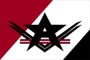
Second Flag (2010-2013)
Original of the second flag of the RPF
The second flag already much resembles what we can see nowadays. However, the most significant change from the previous one definitely is the switch in the colour pattern. Instead of red, black, and white, we can now observe the positions of black and white to be changed. As well, slightly less noticable, the angles of the diagonals have been changed a bit. Now, it creates a more equal separation. And, together with the change in colour, it creates a slight but noticable difference. Atop, again, is placed the army symbol, this time without any text.
This flag beautifully shows us something: despite being as old as 2010, the general design is still to be seen today. When looking at this old example of a flag, one is immediately able to recognise that it belongs to the RPF. It shows how timeless the design is and how much the RPF stuck to its original symbolism and ideals over all those years. And, correspondingly, the following flags do not differ much from this either, as you will be able to see.
Third Flag (2013-2018)
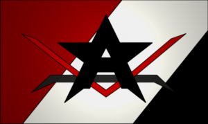
Original of the third flag of the RPF
This flag looks very identical to the 2010-13 flag. However, they changed the emblem by moving the black line and adding it inside the star and the red line. Giving it this very interesting line, crooked towards the ends. In terms of colours, they removed the very low contrast ones. The flag also doesn’t have any border colour on the star.
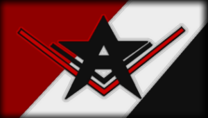
Fourth Flag (2018-Present)
Original of the fourth and current flag of the RPF
The final flag is very amusing to look at. Let’s go examine it one by one. Firstly, in contrast, they added two red lines inside of the star. Completely removing the black one that was found in the 2008-2010 flag. They then added 2 black lines inside of the star and removed the red one. In terms of colours, it brings our a higher contrast compared to the past flags. This is also partially due to them switching to a different shade of red in the base of the flag. However, again, the last section is smaller, more resembling the first flag, even if it makes only a slight difference.
Army symbols
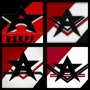
Centers of the 4 different flags, displaying the emblems
As a special addition, today we will also be talking more in detail about the emblems, or army symbols, of the RPF in this edition of Flag Frenzy!
All of the army symbols feature a capitalised letter ‘A’, stylised to resemble a 5-pointed star, in black. As was said, whereas the design changed slightly over the years, the general design stayed from start to present. Alongside a changing variety of 1-2 black and red stripes decorating the star-like A shapes, they all stand representative of the United Servers of the RPF. They serve the purpose of tying together all of the flags. Even all on their own, they make a beautifully recognisable and strong symbol, worthy of a tradition-rich army like the RPF.
Emblems, much like flags, have had almost uniformity for a large amount of time. Over the entire existance of the RPF, spanning more than 1½ decades, they have barely changed. Having pretty much uniform symbolism in place for so long, yet still presenting an appealing image shows exactly this: strength in uniformity, tradition and power alike. It is no wonder the symbols of the RPF have played a large role in the army’s identity over such a large period of time.
Club Penguin Armies decided to reach out to RPF legend Silverburg regarding statements about the emblems of his former army
Do you know why the emblem of the RPF has changed?
I guess they wanted to add more lines? And also take the darkness out of the red and black colors on the old one. I prefer the old one though. Old one is nostalgic, new one is very corporate
Do you think the emblem should be changed?
Naw, I think lots of companies are changing their logos to be more minimalist so RPF should do the same. People follow trends and are very enthralled with pattern recognition
The Rebels have had a long and rich history – also including a large importance of vexillology. The relative similarity between all those flags and emblems over the years showcase the essence of the army well. Were you surprised by how little the flags of the RPF have changed? What army do you think should be covered next?
Shinzō
Reporter in Training
HistoryLover
Reporter in Training
More Information

Reporter in Training for the CPA and Head Journalist for the Gazeta Husarska. WH Monarch and former Emperor.