KLONDIKE, CP Army Headquarters – Welcome back to “Artistic Analysis,” wherein this edition, we look into the graphics that Maxie/happy_phantxm created and understand more about his journey in the graphic design community.

This week in Artistic Analysis, we dive deeper into what made Maxie/happy_phantxm a graphic designer. Before we begin, let’s take a quick look at his history within the army community. On August 4th, 2019, he joined the army community as a troop for Rebel Penguin Federation. He then left RPF to join and help with the revival of Dark Bandits as Third in command on May 4th, 2020. He left the Dark bandits as Second in Command and then created the Red Ravagers as one of the leaders on June 9th, 2020. He also holds a Graphic designer role in Club Penguin Army Headquarters.
Maxie started designing in June 2020 for leagues and armies. Now that we know more about Maxie’s history in the community, it’s time to look at some of his creations. With multiple designs, from discord banners to competitions to even designing for CPAH and CPAHQ.

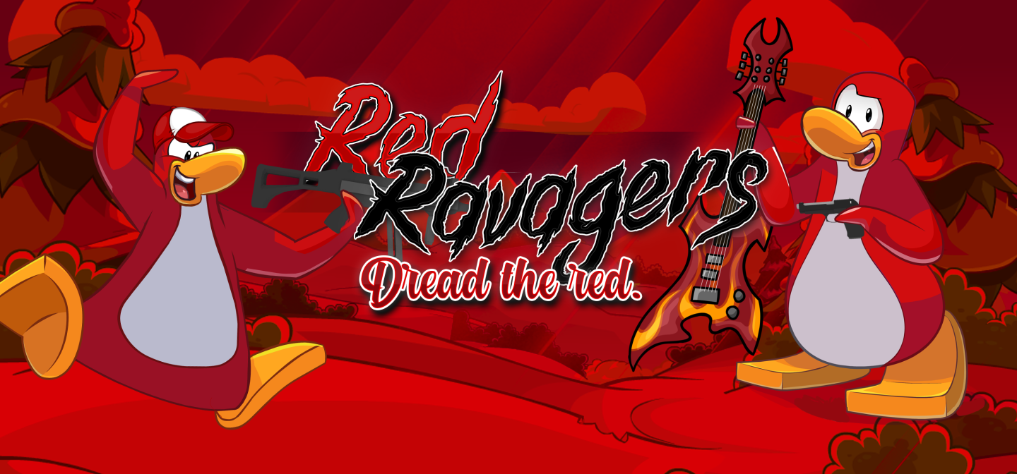
Red Ravagers Discord Banner – June 8th, 2020

Chaos banner made for CPAH underpaid & overworked graphics tourney – August 26th, 2020

SWAT Header – October 15th, 2020

Red Ravagers banner – February 8th, 2021
CP Army Headquarters talked to Maxie about why he started designing within the army community.

What or who influenced you to become a Graphic Designer?
I originally wanted to start doing graphics because I started RR, and I wanted the graphics to be made entirely by me/RR staff. Then I sort of fell in love with designing and Zamb was a huge inspiration. He taught me the basics of photoshop and a couple of his tricks. I regard him as my mentor <3
When did you start designing things, and what software do you mainly use?
I started graphics in early June of 2020 before I created RR. I tried GIMP and Paint.net briefly, but I’m nearly exclusively using Adobe Photoshop. I’m also beginning to use Adobe Illustrator more, but Photoshop is definitely my go-to.
What are some things you would like to improve on regarding graphic design?
I want to improve on my layer style. I always find that my graphics are either too dull or too noisy, and I want to focus on finding a balance. I also want to establish my own style a little more.
What aspects do you feel are essential to add to any specific design?
Bold color choices and appropriate fonts are crucial. Composition also plays a huge role, especially for army graphics like banners and headers and server icons, because they serve the purpose of getting attention and looking professional. I personally love a colorful bright look to my graphics, and I love colors that pop. Also, outlines >>>>
Is there anything else you would like to add or say to the community?
KEEP MAKING ART!!! Even if you think nobody cares or you think you’re bad, KEEP MAKING ART. Somebody is waiting for you to make your next piece whether it’s a drawing or graphic or painting or song or sculpture or anything you dub as art. And you will always get better with practice. be kind to people dread the red.
–
So, as you can see, Max has a lot of things to say about being a graphic designer. As many other artists have said, practice makes perfect. Designing does not come quickly; The community is constantly changing with different aspects of art. Even in Max’s case, you can start relatively soon, and you have to work on it. Take the friendly criticism to heart and progress from your past work.